Wyndham Championship’s visual identity has 2 key elements: logos and colors.
LOGOS
Full
The Wyndham Championship signature is at the center of our brand identity. It’s vital that these guidelines are always applied consistently.
Always reproduce the signature according to specifications in these guidelines. These examples illustrate only some of the many possible unauthorized uses of the signature, none of which are permitted. For reproduction purposes, always use the digital artwork supplied.
![]()
The preferred signature color is the one-color blue solid version. This version should be used for all printed communication materials whenever possible. When the signature is placed against a dark color background, a reverse signature (white) must be used.
MINIMUM SIGNATURE SIZE
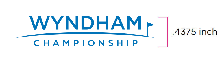
The size of the signature may vary depending on the application. To ensure legibility, the minimum size at which the signature may be reproduced is 0.4375 inch tall.
CLEAR SPACE
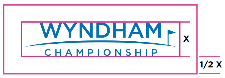
To give full impact to the signature, do not crowd it. Let it stand apart from surrounding text and imagery. The minimum required clear space surrounding the signature is 1/2 X (“X” is the height of the signature).
Any uses of the Wyndham Championship logo must be approved by the tournament. Please send all logo requests and proofs to Leslie Johnson.
COLORS
Full
Wyndham Championship Blue is the foundation of our brand’s visual identity. In most cases it should be the first color our fans see.
Our primary palette consists of three colors: Wyndham Championship Blue, Wyndham Championship Grey and White.
Wyndham Championship Blue is the core of our identity and should appear whenever possible so fans can immediately recognize our brand. It should only ever be paired with Wyndham Championship Grey or white or on a case-by-case basis on top of photography.
WYNDHAM CHAMPIONSHIP BLUE

WYNDHAM CHAMPIONSHIP GREY

For best color reproduction, follow the numbers in the guidelines. Please follow the RGB and CMYK calculations in the guidelines as well.
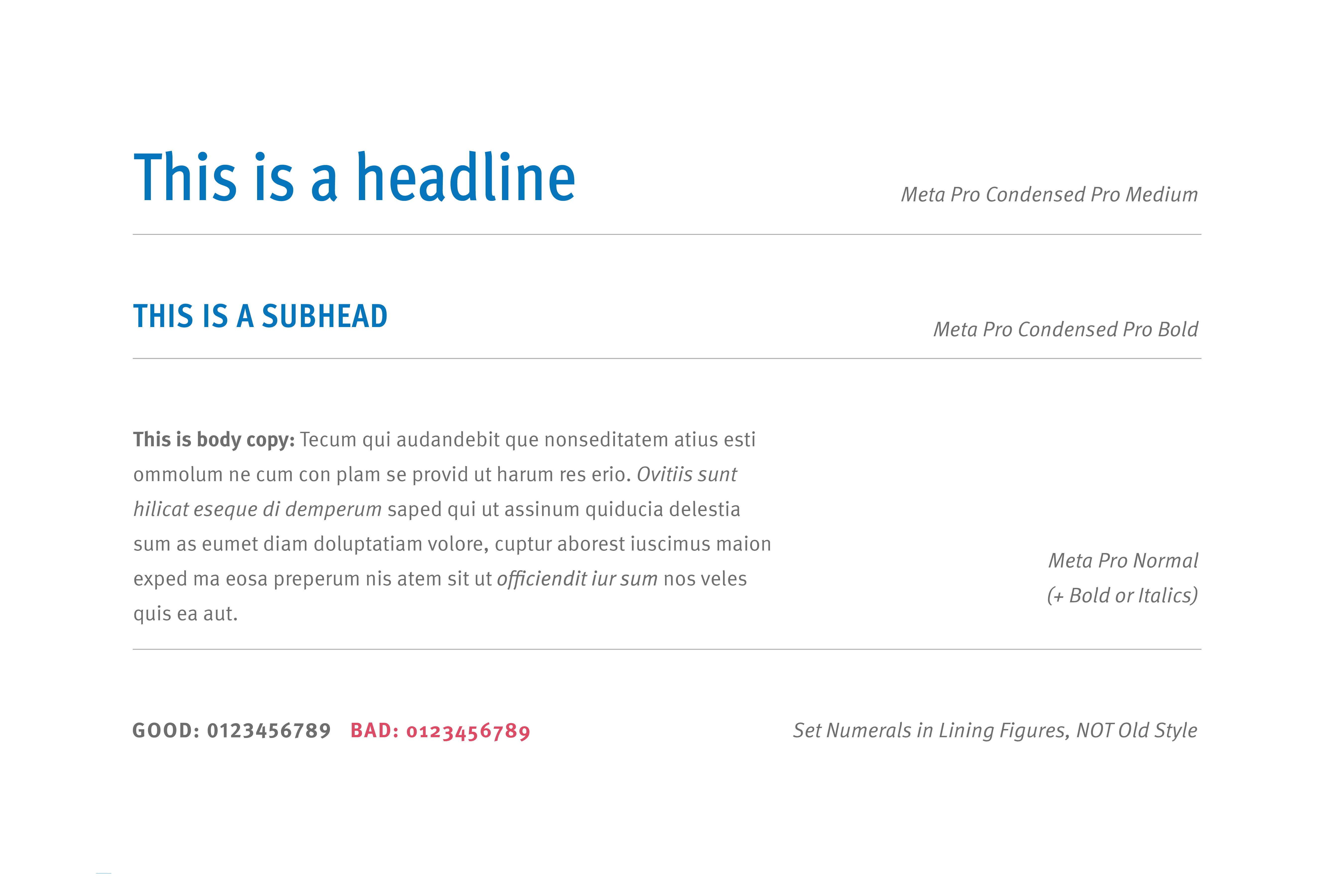
FONTS
Full
Headlines are created using Meta Pro Condensed Medium and/or Meta Pro Condensed Bold. For more detail on how headline lockups look, see below. Body copy is always set in Meta Pro, primarily using the Normal weight. Use Bold or Italics as necessary to establish visual emphasis to parts of body copy, as needed.
For numbers, use Lining Figures, not Old Style.